Minggu, 14 September 2014

BB Cream Comparison (Dr Jart+ VS Etude House)

dr jart etude house precious mineral cotton fit bb cream
BB Cream Comparison (Dr Jart+ VS Etude House)

i got the etude house precious mineral cotton fit bb cream tester from my korean beauty haul, it's in the same shade as my any cushion - W13. i'm not too sure about the differences across the precious mineral bb cream lines, they come in a variety. i believe cotton fit is meant to give you a matte and silky smooth skin that feels like cotton candy.

as for dr jart's bb cream, it's mean to give you a moisturized and even complexion, touted as the 'detox bb cream'. hmm? really? you can read my review here.

dr jart etude house precious mineral cotton fit bb cream

dr jart etude house precious mineral cotton fit bb cream


COLOUR:
dr jart: appears slightly darker and ashy when unblended. looks slightly pinker than etude house. when spreaded out, it appears to be a ashy beige.

etude house: appears much more yellowish when unblended, also much lighter in colour than dr jart. when spreaded out, it appears to be peachy.

COMPARISON:
dr jart is slightly darker and pinker.
etude house is slight yellower and brighter.

IMHO
on my hands, the colour of dr jart looks pretty horrible as compared to etude house. but dr jart actually looks very natural on my face as it brightens naturally. i guess the greyish tone neutralizes the yellow on my skin gentle, whereas the etude house makes my face look really really fair.

Kamis, 11 September 2014

Dr Jart+ Black Label Detox Healing Blemish Balm (Swatch + Review)

Dr Jart+ Black Label Detox Healing Blemish Balm

just how long do i keep my makeup products? for quite long. i've retired this bb cream as of late, but i want to note down a little bit more about this product first.

i got this about 4 years ago and it's my first full sized bb cream. i remember seeing my cousin use it and i love that it has a higher coverage than most bb creams in the market at that time (back then the skin79 was really popular, but too watery and thin for me).

it has served me well the past few years. by now, dr jart has already changed their packaging (i realize they have a slight different packaging for the american market) and offer a lot more selections in their base makeup line. back then it was only the silver label (meant for oily skin) and black label (for drier skin).

Dr Jart+ Black Label Detox Healing Blemish Balm
product description at the back of the tube.

1. whitening
2. anti-wrinkle
3. sun protection (SPF25)

Dr Jart+ Black Label Detox Healing Blemish Balm ingredients
ingredients list from a while ago.

the things that stand out to me are: sweet almond oil (for moisture), arbutin (for whitening), all the other floral extracts are pretty much at the bottom on the ingredients list, i doubt they have said effects. collagen and Q10 (ubiquinine) too? wow, i just realize how much skin care stuff is in this product, at such a minute concentrations (lesser than the preservatives, also known as parabens). can't dispute the "detox healing" branding of this product! but efficacy? that's another story.

Dr Jart+ Black Label Detox Healing Blemish Balm
comes in a squeeze tube with a rather huge opening.

Dr Jart+ Black Label Detox Healing Blemish Balm Swatch
taken in two different lightings: natural and camera flash.

the bb cream has a greyish undertone to it (but do not be alarmed! more on that below!), but blends out to offer a slight hint of brightening for the skin. it doesn't appear warm nor cool after blended out - just neutral.

Dr Jart+ Black Label Detox Healing Blemish Balm Swatch
close up in flash lighting.

this bb cream leans on the moisturizing side, so there's a slight sheen to it. there'a also a slight greyish/white cast in flash lighting.

the product is scented.

IMHO
firstly, even though it appears very greyish on my hands, it is able to brighten my face pretty well. i think it's because the grey is able to counter the pink and yellow tones on my skin and neutralizes it to give an illusion of fairer and brighter skin. it is rather mind boggling because the bb cream appear to dark coloured and grey on my hands in another swatch i did (will be up soon), but on my face, it looks just fine!

secondly, perhaps it's the age of this product, or it could be the weather (and the constant blotting of my sweat), this product can't stay on my face for too long - it loses its brightness after a few hours in the heat (even after powdering). however, in an air-conditioned setting, my face stills look bright and fine! this is a very moisturizing bb cream, so i think it's best for cold and dry weathers instead! for the hot and humid weather in singapore, i'm better off with my revlon colorstay foundation.

thirdly, the coverage of this product suits me pretty well. it's consistency is a little stiffer than normal bb creams, it's pretty much like tooth paste! like i said, i got this because i needed something of a higher coverage to lighten my dark circles, and i got what i wanted :D

i can't say much about the anti-wrinkle and whitening effect of this product. don't bank so much hope on it, really. i use it for its higher coverage so that i can lighten my dark circles and brighten my T zone and inner cheek area. assuming that the maximum concentration of parabens allowed in the product is 4g/kg of product (meaning 0.4 w/w%), the concentration of said skin care benefits must be even lower than that. not sure if that will be enough for anything to happen.

i purchased this from hk for HKD$120~.

IN A NUTSHELL
1. able to brighten up my face even though it has a strange grey cast on my hand
2. creamy and blendable
3. slightly higher coverage than watery bb creams
4. scented
5. moisturizing (and thus, not long wearing)


MAKEUP LOOK

i used to wear this very often in the past as it was the only foundation i have. i still use it when i want to create a very moisturized and dewy look.


xoxo
karman

Selasa, 09 September 2014

Burgundy Smokey Eye Tutorial For Asian Eyes


Fall Makeup #1: Burgundy Smokey Eyes For Asian Eyes

i'm surprised how much love this look garnered when i first shared it on my instagram. i thought the look was a little to dark for daily looks, but SURPRISE SURPRISE! so here's a tutorial on it :D

it's definitely fall inspired, it's probably the only time i can feel comfortable wearing this much burgundy colour out in public. and that berry tinted lips? I LOVE IT. wearing it full on makes me look too old for my liking, therefore a slight tint (with a touch of gradient lips) is the best way for me!


i have been experimenting with burgundy of late, and i realize it works best when i apply it to the outer corner instead of all over my eyelids because the latter will give me a bruised eye look. =_=

i believe this will work for almost all kinds of asian eyes because of 2 reasons:
1) asians tend to have a smaller "double-eyelid-fold to eyebrow" distance when the eyes are open. it's safe for us to place the main colour on the outer corner instead so that the colours can be seen blending into the skin (as opposed to being hidden by our eyelid folds). of course, there are some asians with a lot of eyelid space to place with, this look will still suit you though!

2) i'm using the eye socket as a guide for this eye look. whatever makeup looks that references the eye socket will technically conform to each and everyone's original proportions much more better than if i were to use any fixed number like "5mm above your eyelids".

browns with a reddish hue (think of rose golds) will complement the burgundy well. i'm not sure how this look will turn out if you used yellowish browns. the kate colorcious diamond palette that i own happens to be pinkish/reddish toned.

watch the video tutorial here!


PRODUCTS USED____________________________________________________________


from left to right, clockwise:
1. innisfree no-sebum mineral powder
2. sonia kashuk hidden agenda concealer palette 07
3. loreal lucent magique foundation N2 pure porcelain
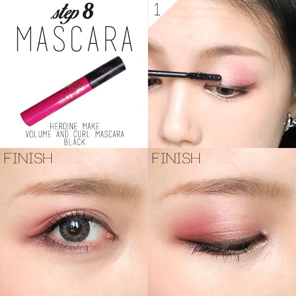
4. heroine make volume and curl mascara
5. kate designing eyebrow N EX-4
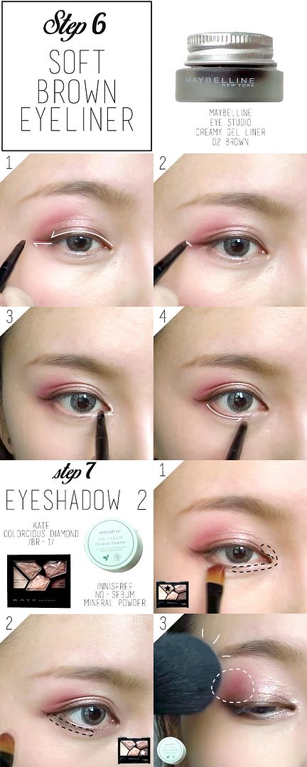
6. maybelline eye studio creamy gel liner 02 brown
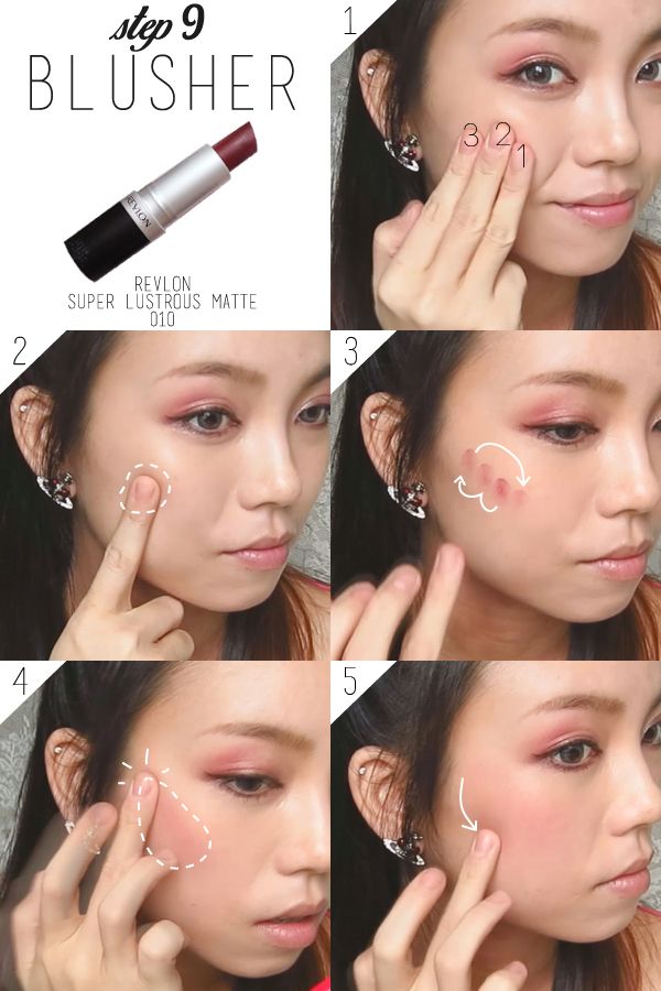
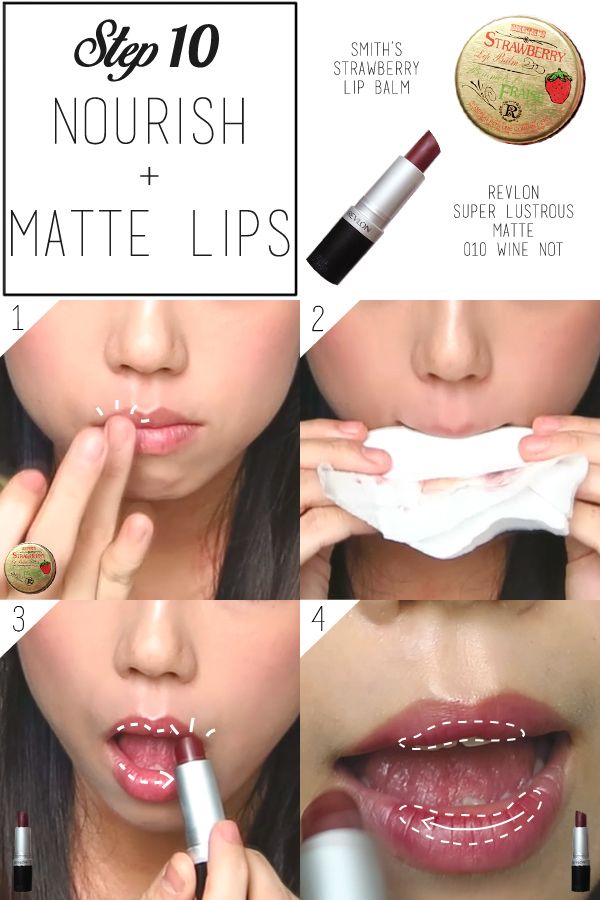
7. revlon super lustrous matte 010 wine not
8. kate colorcious diamond BR-1


from left to right:
1. smith's strawberry lip balm
2. meishoku organic rose moisture cream

BRUSHES USED:

from left to right:
1. elf studio complexion brush
2. essence eyeshadow brush
3. generic eyeshadow brush (flat and has a rectangular surface for picking up colours)
4. maybelline eyeliner brush
5. kate eyeliner brush (cut into an angled brush for eyebrow)


PICTORIAL_________________________________________________________________

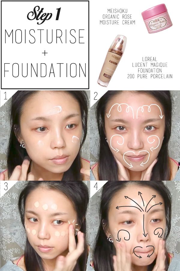
simple pictorial to supplement the video! i've marked out all the different areas for different products!

FACE:

the moisture cream and moisturizing foundation is meant for dryer climates since autumn tend to be drier. this is just a demonstration! please use your trusted foundation according to your climate and needs. switch up the heavy cream with a light lotion if necessary.

the warmth from the hands help the foundation stay even closer to your skin!


click on image to enlarge!

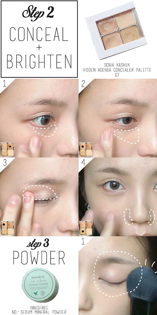
make sure to conceal and colour correct any form of redness on your face. you wouldn't want redness for this look because burgundy is already reddish hued. more redness on your face will tip the entire balance of this look off the scale. also, as the eyes are taking on a darker look, brighten the under eye area for better contrast.

if you've no idea how to conceal the dark circles, you may like to refer to this entry where i go more in depth into that science behind it. basically you'll need a slightly darker colour to colour correct and cover the dark circles (for my skintone, a peach colour worked great), followed up with brightening with a lighter shade. i went beneath my "eye bags" to lighten up the shadow and to lift my inner cheek area.

set the concealer by patting the fluffy brush over the entire eye area. keep the face powder-free.


click on image to enlarge!

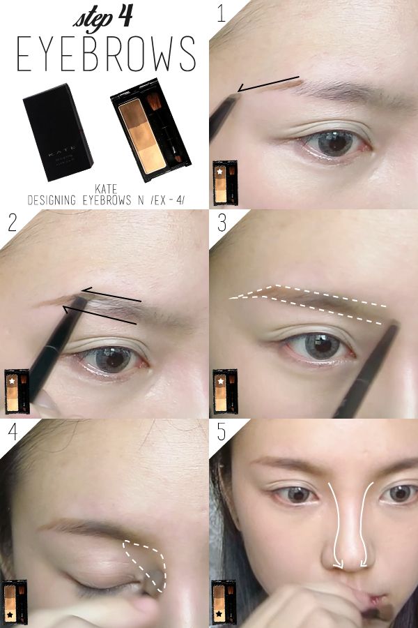
EYEBROWS:

i made my brows look more arched for this look because you can't deny it: this look is leaning on the more mature side. an arched brow will complement the look really well.

if you don't know how to make your eyebrow appear more arched, just extend the first line downwards, beyond the end of your eyebrows.

make sure to contour your nose as we wouldn't be using a highlighter for this look as there will be too many focus on the face in that case.


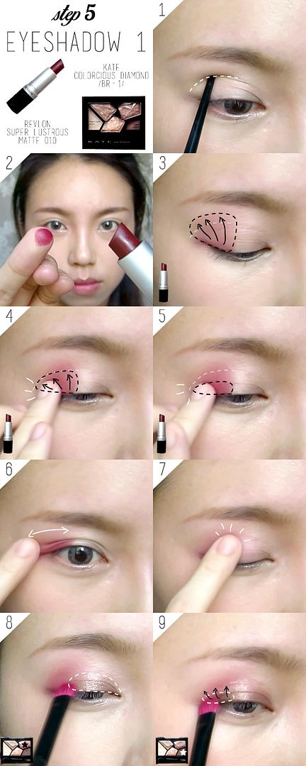
EYES:

before you start on your eyes, you'd need to find out where is the hollow of your eyes first. i poked my eyes to show you what i'm talking about. you really just need to feel the bone with your finger. use that as a guide for this look.

in the pictorial below, that guide is denoted by the white dotted line. the first wash of burgundy goes slightly beyond the dotted line (the middle of your finger pad should be touching the socket bone boundary, this will already get the colour beyond the socket).

slowly build up the burgundy colour to get that wonderful gradient, the area gets progressively smaller so most of the colour is concentrated nearer to the lash line. we'll then smoke it out with a dash of dark brown near the lash line, making sure to blend it upwards but not exceeding the height of the burgundy colour.

don't forget to blend out any harsh edges with your finger (in the 6th and 7th picture).


click on image to enlarge!

use a brown eyeliner to complement the burgundy colour. you don't need a very distinct eyeliner for this look in fact. give it a slight wing for a flirty look.

add some bling into the eyes (as always! i don't think i ever did a look WITHOUT glitter) to add to the contrast.

the matte lipstick blends really easily, but it will definitely require setting because it does come off by rubbing. set it the way you set the concealer.


click on image to enlarge!

apply the mascara. i used a waterproof formula to hold curls better. focus the mascara on the inner half of the lashes to contrast the brighter inner part of the eyes.


click on image to enlarge!

CHEEKS AND LIPS:

another special point of this makeup: the blusher will be on the outer half of the cheeks. use your fingers as a guide to help you find where to concentrate the colours on.

place your ring finger on the apples of your cheeks, the part where your first finger rest upon is the part which should get the most colour.

again, using your bone structure as a guide, dot along your cheek bone, blending the colour below your cheekbone initially before blending out the edges above the cheekbones. this will get you a more contoured face very very naturally.


click on image to enlarge!

moisturize your lips with a lip balm, blot off the excess so that the lip colour can go on easier. if you want a tinted look, dot the lipstick on. for a slightly darker look, apply more lipstick on the inner half of your lips.


click on image to enlarge!


FINISHED LOOK____________________________________________________________

i happened to take more selfies this time because i actually remembered to. :)


i'm wearing my geo tri colour gray. it's the only colour lens i have for now.


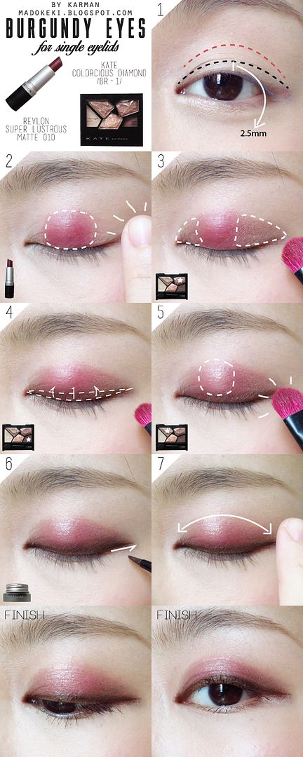
FOR SINGLE EYELIDS

i was inspired by an eye look i saw on the etude house community one day, i thought it suited single eyelids SO PERFECTLY. i don't have single eyelids, so this is the best i can do when it comes to a tutorial for single eyelids.

step 1 requires you to decide where you want the boundary to be.
1. the black line is about 2.5mm above your visible lash line when your eyes are open (very important for you to find this boundary with opened eyes). feel free to change this height according to your liking. for a lighter look, stick to a smaller number.
2. the red line is on your socket line and is the maximum height you can go for, this will be a slightly heavier look. anything above the socket line may look out of proportions.

once you decided which boundary to use, just follow the steps. the techniques are the same, the only difference is the colour difference.


click on image to enlarge!

FINAL LOOK


clearly, this colour placement don't look that good when my eyes are fully opened because my eyelid folds covered all of the gradient. what you see is a very distinct "cut" between the colour and my skin. that's why.. i do not have enough lid space (space between my eyelid fold and my eyebrow) to do a gradient. i'd say this look is suitable not just for single eyelids, but also for people with a lot of eyelid space. typically, they happen to have single eyelid or very narrow double eyelids.

hope you like this tutorial!

xoxo
karman

Senin, 08 September 2014

pupa multi-effect baked eye shadow duo 30

Pupa Multi-Effect Baked Eye Shadow Duo 30

this is another eye shadow that is gifted to me by my girlfriend.
you know she's a keeper when she feeds my addiction without me asking!

i'm not too familiar with pupa then (even now), she just picked this colour for me thinking it'll suit me.
it's a eye shadow duo that comes in two shades of blue.
anything baked has a good colour payoff. this is no exception.

it comes in a clear plastic case, and a dual ended sponge tip applicator.


Pupa Multi-Effect Baked Eye Shadow Duo 30 Swatch

Pupa Multi-Effect Baked Eye Shadow Duo 30 Swatch
swatched over powder foundation.

the two swatches on the left are wet swatches, while the two on the right are dry swatches.

the darker shade is a electric blue that has a iridescent/metallic/chrome finish (i can't find the right word to describe it, there is a this sheen when seen at different angles). i see some red micro glitter in it!
the lighter shade is a shimmery wash of light blue, almost a frosted finish but contains a lot of silver micro glitter and shimmer.

both the shades are very soft and pigmented, of course if it is applied wet the colour will be even more solid.
the powder are picked up easily by either a brush or fingers. i seldom use the sponge tip applicators, but when i did use it, it sort of took away that metallic sheen to the darker blue shade.

IMHO:
i seldom wear this palette on its own. i usually pair it up with the kate diamond cut palette to create an electric blue eyes. i like that the finish of the dark blue shade, for it shows its true colour as compared to shimmery or glittery shades.
this palette is so versatile as it can be worn dry or wet.
i usually apply the lightest shade on the centre of my lid to make it standout, while using the dark blue shade as an electric blue eyeliner on the outer corner of my eyes.

Jumat, 05 September 2014

Revlon Colorstay Foundation 200 Nude (Swatch and Full Review)

Revlon colorstay foundation 200 nude swatch review
Revlon Colorstay Foundation 200 Nude (Swatch and Full Review)

i just checked back, the first time i tried this foundation was in mid april. it's now mid august, a good 4 months. it's about time to do a full on review on this foundation, which has quickly risen to become my favourite foundation out of the few that i have. bye bye dr jart bb cream!

a little recap on the product:

Revlon Colorstay Foundation 200 Nude
i got it in the shade 200 nude.

the foundation comes in a glass bottle with a black cap. i like simple packaging! a lot of people complain about the lack of a pump. initially, i detest it as well because i find it difficult to control how much will end up flowing out. BUT! after 4 months of our loving relationship with each other, i've learnt to overcome the difficulties and to devise ways to make things work out for us (just like another other relationships huh!).

i find that it's easiest for me to shake the bottle so that the product will hit the root of the cap, and then i just have to open the bottle and dip my finger into the pool of product on the bottle cap and VOILA! it's even better than a pump that way because some pumps may dispense too much products at one go, and isn't that friendly about letting you do a half pump.

the only issue that may still concern some will then be the hygiene issue.

some of the claims off the bottle:
1. wear for up to 24 hours.
2. flawless look, lightweight feel.

Revlon Colorstay Foundation 200 Nude Ingredients
ingredients and usage instructions concealed within the white sticker that can be peeled open.


Revlon Colorstay Foundation 200 Nude Swatch
taken in two different lightings: natural and camera flash.

200 nude is a light peach colour with a tinge of pink undertone. 180 sand beige has more yellow in it, but just as light.

Revlon Colorstay Foundation 200 Nude Swatch
close up in flash lighting.

you can see the blended foundation as a slight sheen to it. it's a very lovely and natural looking foundation that imparts a slight sheen to it. i find that a fully matte product looks way too unnatural on me. this is just perfect for my needs.

IMHO
i did like it after trying it out the first time because it's incredibly sweat resistant, but i was quite aghast at the white cast it gave me (because i applied too heavily and over an area too wide). i must admit that this colour is not matched to my skin tone, that's why it had that kind of effects on me. i got this foundation because i wanted to use it on the centre of my face as brightening. my complexion is okay enough to skip a full face foundation routine.

after so long, i can finally declare my love for this foundation. i feel like it's a MUST HAVE for me because i simply sweat too much. being sweat resistant earned it a lot of brownie points. the fact that it stayed bright on my face after the entire day makes me love it even more - it doesn't oxidize on me.

also, in my first impression video i spreaded this thing out with my fingers, not the smartest move. i've since learnt to use my foundation brush to blend it out after dotting it on my face with my fingers. you can watch how i do it when i demonstrated my summer proof makeup. the coverage is light to medium coverage. when blended out with a foundation brush, i get a really light coverage which helps with brightening.

i can't be happier with my purchase because the peace of mind this foundation gives me is worth more than anything. i don't need to worry about foundation being blotted off by my tissue paper, uneven skintone after some time roaming outside.. :)

just do note that my skin isn't SUPER OILY to begin with. this foundation is meant for oily combination skin, but i've read reviews that it's not as efficient in the oil control department. i don't remember seeing my face looking very shiny at the end of the day (maybe because i blotted the oil and sweat off all at one go?). if you fall into the group with horribly oily skin, an oil control base would definitely be your best friend. if you sweat a lot like me, consider investing in this drugstore gem.

i find myself reaching out for this foundation subconsciously whenever i know i'll be out in the heat for an extended period of time.

i bought it from watsons when it was having a sale for $24.90.

IN A NUTSHELL
1. very sweat resistant
2. acceptable oil control properties (but i'm not a good gauge)
3. doesn't oxidize on me
4. wear for at least 8 hours on me.

MAKEUP LOOK

i've worn this many many times by now :D you'd have known if you saw my instagram! i wear this on the centre of my face only.


xoxo
karman

Selasa, 02 September 2014

Japanese Harajuku Makeup (Zipper Inspired)


Japanese Harajuku Makeup (Zipper Inspired)

minna-san konnichiha (konnichiwa)! that's about as much japanese i can speak, but i can't help it because wearing such a japanese look make me wanna speak some japanese (even if mine is really bad).
if you don't know what is Zipper, here's a front page of the magazine that focuses on harajuku fashion that targets young teenage girls, which sort of explains the loud colours and style.


there're many different models in the magazine, the more well known one is probably amo (i've done an inspired look meant for daily wear before). this time, i am more interested in another model by the name of ayumi as her vibrant and colourful makeup is something i find really interesting.


inspiration for the look i did!


the main points of the look are:
1. very fair skin
2. light coloured eyebrow
3. vibrant/pastel/light colours on the eyes and winged kitty eyes
4. blusher is applied above cheek bone and below eyes
5. berry toned lips (the only thing that's slightly darker on the entire face)

watch the video tutorial here!


PRODUCTS USED____________________________________________________________


from left to right, clockwise:
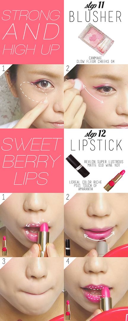
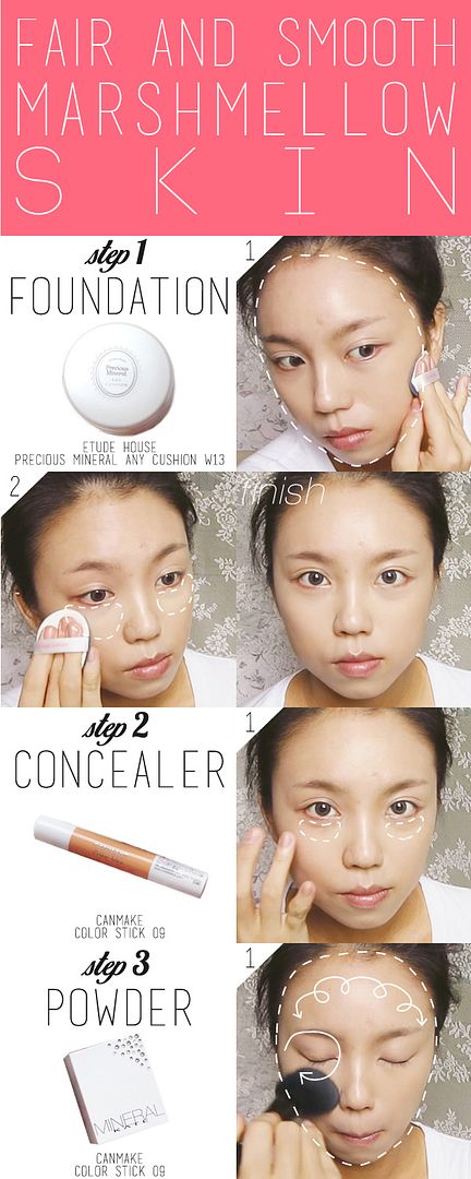
1. etude house precious mineral any cushion W13
2. kate mineral powder foundation OC-B
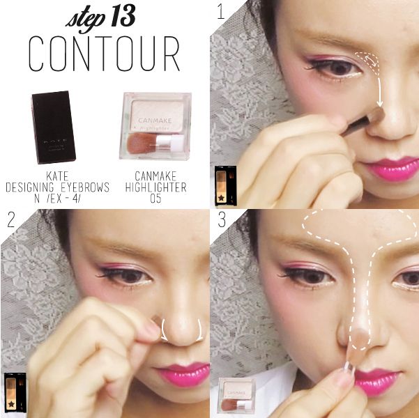
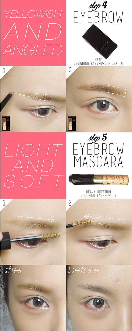
3. kate designing eyebrow N EX-4
4. heavy rotation coloring eyebrow 03
5. revlon super lustrous matte lipstick 010 wine not
6. makeon super long lasting waterproof gel pencil liner S05 gold
7. canmake highlighter 05
8. canmake glow fleur cheeks 04
9. canmake color stick 09
10. maybelline hyper diamond shadow PK-1
11. maybelline eye studio lasting drama gel liner BLACK
12. loreal color riche lipstick P511 touch of amaranth
13. maybelline the falsies mascara BLACK


BRUSHES USED:

1. elf studio complexion brush
2. kate eyeliner brush (cut into an angled brush for eyebrow)
3. maybelline eyeliner brush
4. generic flat top eyeshadow brush


PICTORIAL_________________________________________________________________

simple pictorial to supplement the video! i've marked out all the different areas for different products!

FACE:

if you are just like me with slightly darker and yellower skin, you'd want to apply the foundation over the entire face generously. making sure to brighten the area under the eyes especially. conceal any dark circles and set with a powder after that.

marshmellow skin is referring to the soft and smooth skin of a marshmellow, japanese dig that!!! to prevent caking, it's best to apply the powder with a large fluffy brush.


click on image to enlarge!

EYEBROWS:

i think japanese brow products tend to be on the yellowish side because people usually dye their hair towards that side of the colour spectrum. so much so that yellowish and light coloured eyebrow soon became the "japanese eyebrow". of course, it has got to be slightly angled upwards too! arch is optional.


click on image to enlarge!


EYES:

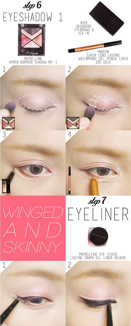
this time's instruction for the eyes seems a little more complicated than usual because i keep going back and forth with the eyeshadow. you save the eyeliner for the last step if you know exactly where to put the pink colour. i only did my eyeliner first because it gives me a guide for filling in the pink later on.

do keep all of the colours WITHIN your eyelid folds so that when you open your eyes, the lid area above your folds are clean.

try your best to give yourself a really elongated wing that's pretty steep because it helps to give you kitty eyes (which is another point of this look).


click on image to enlarge!

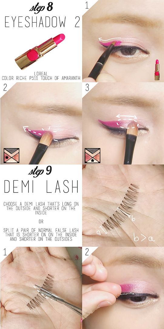
if you have a pink eyeliner that's long lasting and waterproof, you can skip part 2 of step 8 as it's mean to set the lipstick. fill in the pink lipstick on the entire width of your eyelid fold, do not go beyond that.

false lashes are optional, but if you like to, choose those that are longer on the outside to enhance that kitty look. remember to curl your lashes first!


click on image to enlarge!

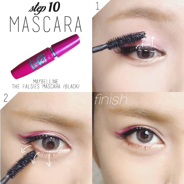
apply mascara on parts of the lashes that aren't covered by the falsies. load up on the lower lashes too! looking at the photo, i should have went for another 3 coats.


click on image to enlarge!

CHEEKS AND LIPS:

probably the most distinctive part of the zipper harajuku makeup: the placement of the blusher. it's between the highest point of your cheek bone and the lower lash line. you can choose to work from below the eyes and slowly bring it down, or do it like me - starting from the cheek bones, bring it up. it doesn't really matter since we'll make sure that the entire area will be just as pigmented in colour. smoothen out any edges and boundaries.

i used 2 lipsticks for my lips to create the berry shade as i don't have such a lipstick yet. if you already have one, just use it!


click on image to enlarge!

CONTOURING:

this isn't a main point of the makeup, but it's essential as we have lightened up our face (which takes away the natural contours). focus on the nose bridge, especially the triangular area between the eyebrow and nose bridge. you can ignore the rest of the contouring (especially if you're used to the western style) because this look IS MADE FOR PEOPLE WITH CHUBBY FACE LIKE ME. round is good :D

i had to sharpen the tip of my nose a little because most japanese have a skinny nose bridge!


click on image to enlarge!


FINISHED LOOK____________________________________________________________

i REALLY REALLY LOVE this look i created. but the sentiments seem to be divided amongst my girl and guy friends. girls find it really cute and dolly looking, while guys.. they just don't know how to appreciate it.

feel free to play around with the colours on the eyes! the most important thing is to lighten the skin with a foundation so that the lighter shades will show up well on the skin. next time i'll attempt a pastel look.

while this may not be the most useful makeup tutorial i've created since this is hardly a daily look for most of us, it's fun to play around with makeup once in a while right? and also to prepare us for the day we set foot in japan so that we can look like one of them :'D


i played around with photoshop to "dye" my hair HAHAHHA which looks the best!?

hope you like the look and find this sharing useful!

xoxo
karman